RLAM Life Sciences

Laboratory culture tray photography overlaid with the RLAM Life Sciences wordmark and the line Cells Created for Growth.

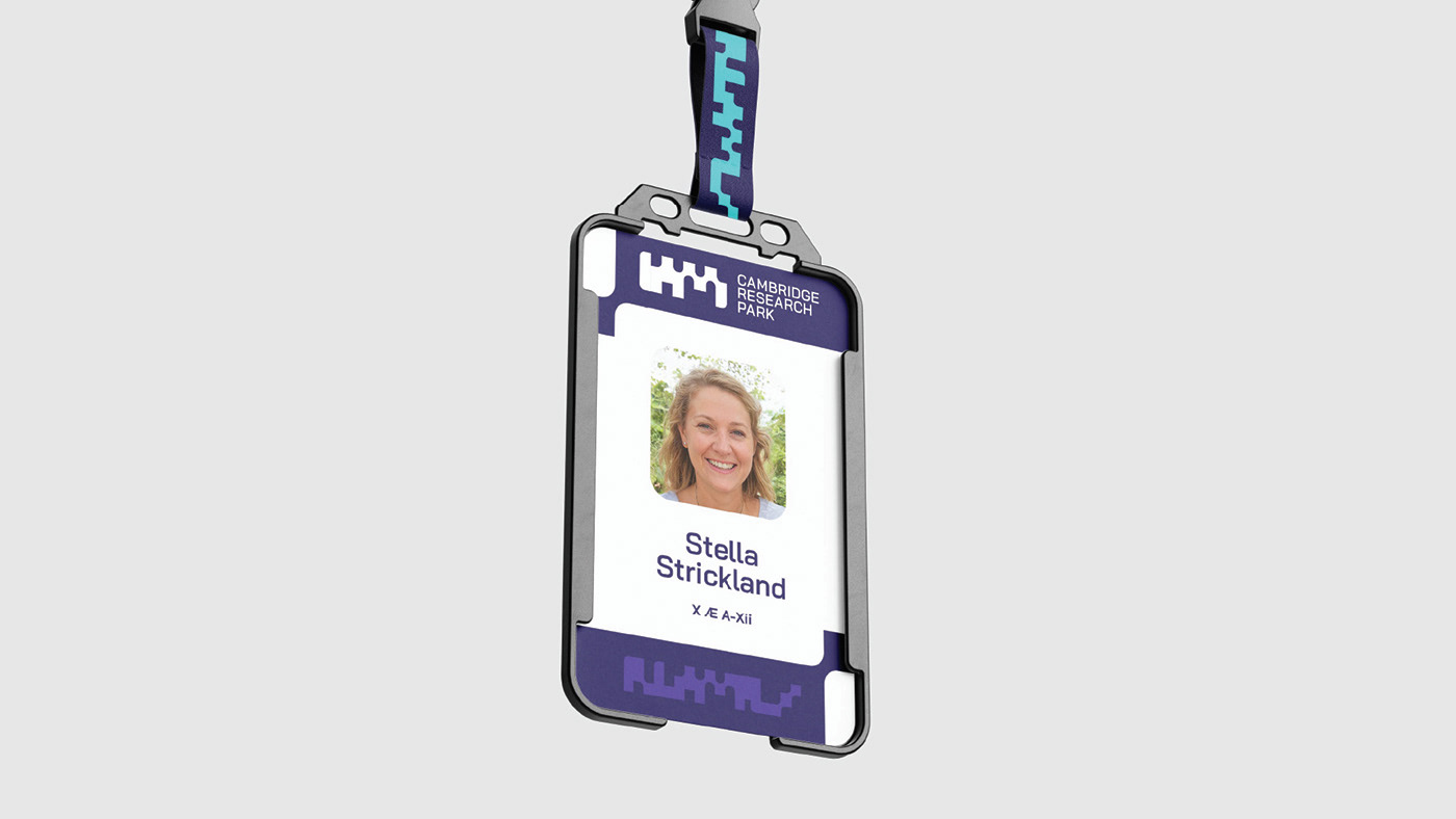
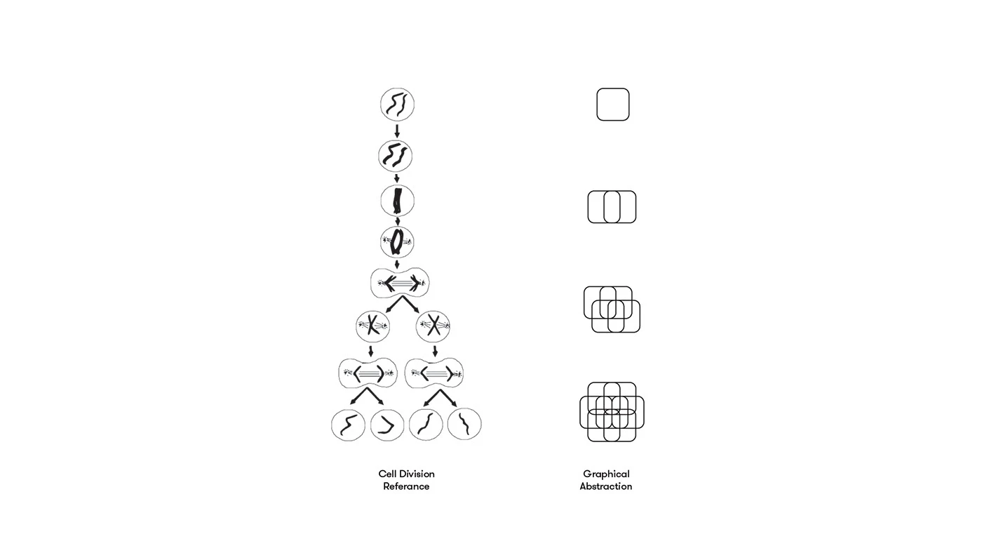
The concept is inspired by the process of cell division, a core mechanism through which living organisms grow. This serves as an analogy for how a tenant within RLAM can begin at a small scale and progressively expand over time. The design reflects structured, organic growth, aligning with RLAM’s commitment to supporting long-term development and scalable potential.
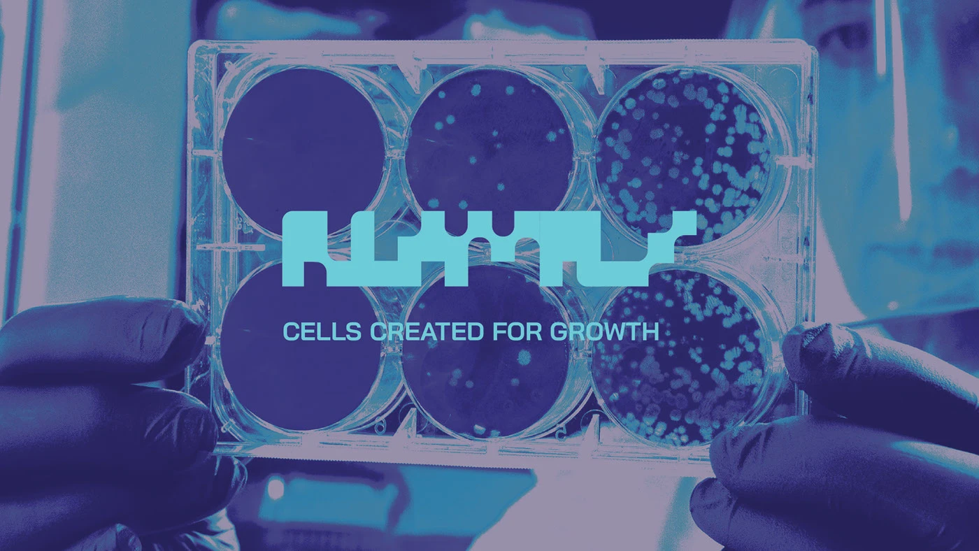
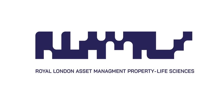
Diagram pairing cell division references with a graphical abstraction of the identity shape.
Custom display alphabet derived from the RLAM identity motif.
Primary RLAM Life Sciences lockup with the full Royal London Asset Management line.

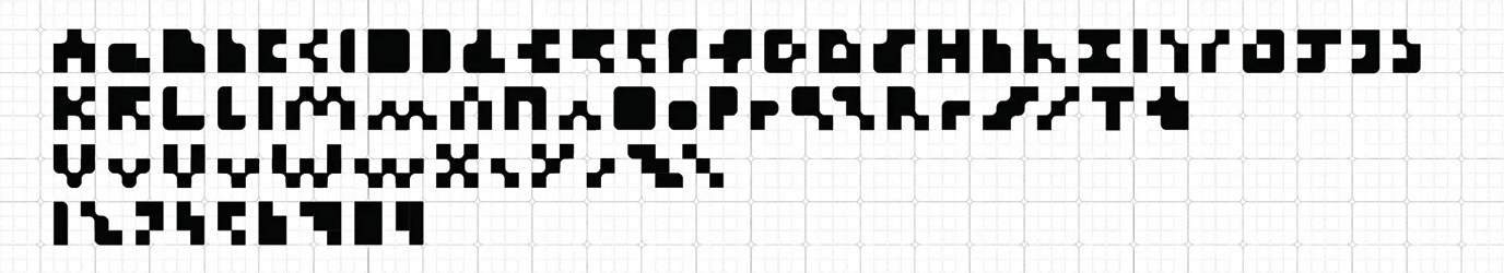
Abi Jamjuree Regular

Font pairings use Bai Jamjuree alongside a custom mark built from the cell division abstraction, giving the identity a precise but expandable system across print, signage and digital surfaces.

Font parings usd BAI Jamaree paired with a custom font based on the graphical abstraction created above.

Partner and lockup variants combining the Royal London mark with the RLAM Life Sciences identity.
A row of distilled RLAM Life Sciences symbol variants.
Reduced icon built from the RLAM Life Sciences mark.
Micro icon reduction of the RLAM Life Sciences mark.

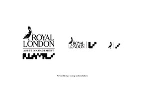
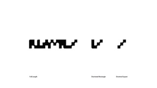
Font pairings and reduced symbols were tested in parallel so the custom forms could hold up from full lockups down to the smallest navigation marks.

Abingdon Business Park logo.
2600 ARC Oxford logo.
One Triton Square logo.
Cambridge Research Park logo.
Branded staff badge application.
Website mockup on a laptop.
Building signage carrying the RLAM Life Sciences mark.
Merchandise tote using the identity system.
Hero campaign card with the RLAM wordmark set against lab photography.
Cell Culture editorial card pairing photography with copy.
Cellar Data collage card composed from multiple lifestyle images.
Evaluate Enhance card showing a blue-toned laptop scene.